Viewing Target Plots
This section describes how to view and use the target plot analysis function.
|
Operations
To view a target plot, perform the following operations:
-
In the upper functional area of the software, select .
-
On the Data filtering tab, filter the data and select measurement records. For details, see Filtering, Viewing, and Exporting Historical Data.
-
Click the Target plot tab at the top of the page.
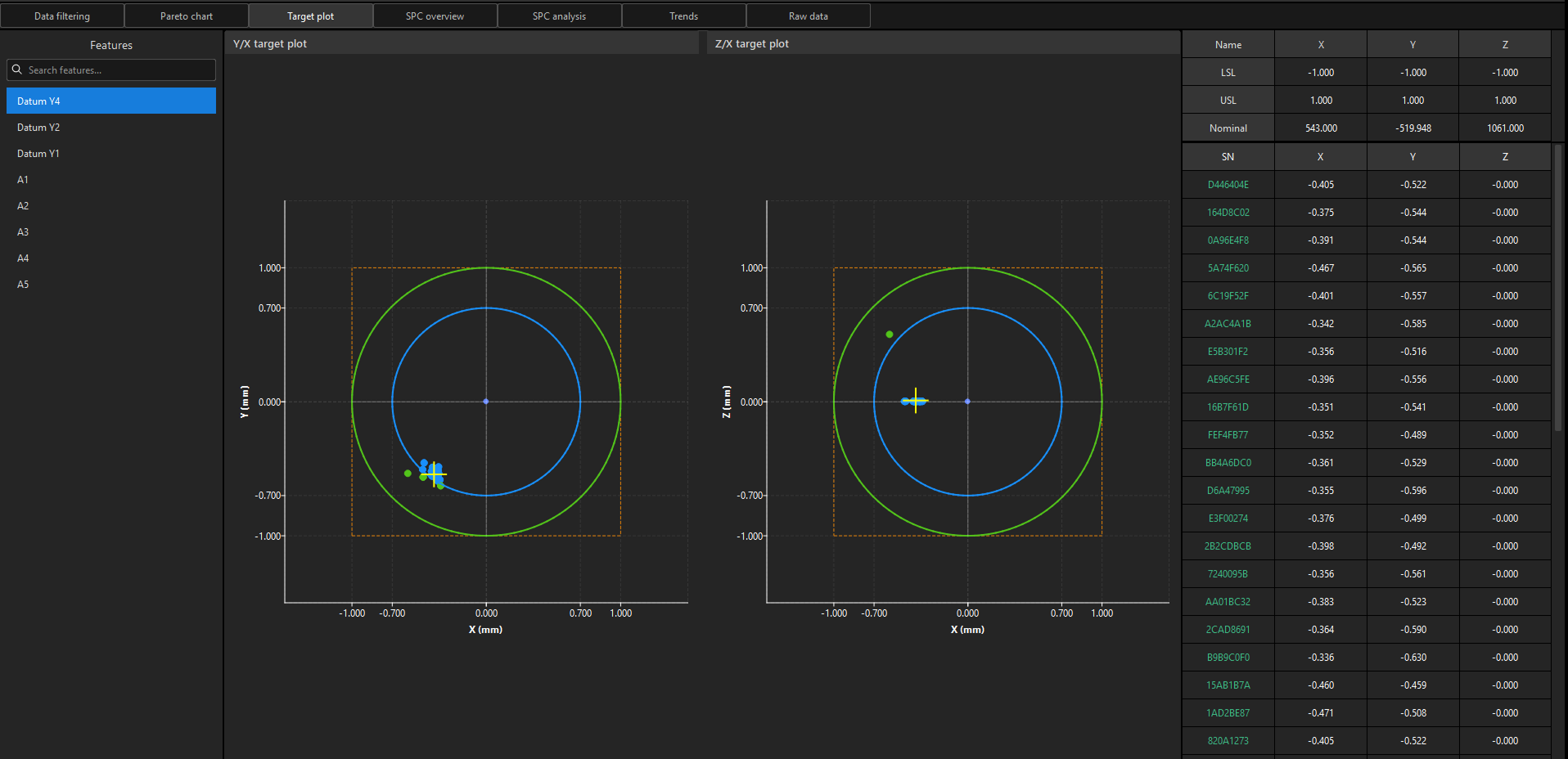
After the preceding operations are complete, you can view the target plot. For how to interpret each area of the target plot, see the description below.
Target Plot Description
The target plot page consists of the feature list, target plots, and tolerance information and measurement data. This section describes how to view the target plot.
Feature List
The left side of the page displays the feature list, which lists all measured features in the current filtering results. Enter a feature name in the search box above the list to quickly locate the feature.
Click a feature, and the middle of the page will display the target plot of the feature, and the right side will display the tolerance information and measurement data of the feature.
Chart Content
The middle of the page displays two target plots side by side, reflecting the deviation distribution of the measurement data in the Y-X and Z-X directions respectively:
-
Y/X target plot: The horizontal axis represents the deviation in the X direction, and the vertical axis represents the deviation in the Y direction.
-
Z/X target plot: The horizontal axis represents the deviation in the X direction, and the vertical axis represents the deviation in the Z direction.
Each data point corresponds to one measurement, and the position of the point reflects the deviation of that measurement from the nominal value. The chart uses different colors to indicate the degree of deviation:
-
Good region (blue): The deviation is very small, and the measurement result is close to the nominal value.
-
OK zone (green): The deviation is within the acceptable range.
-
Warning zone (orange): The deviation is close to the tolerance boundary and requires special attention.
-
NG region (red): The deviation exceeds the tolerance range, and the measurement result is non-conforming.
The mean point (yellow cross) indicates the average position of the deviations of all measurement data. If the mean point deviates significantly from the center, the measurement data contains a systematic offset.
Tolerance Information and Measurement Data
The right side of the page displays the following two data tables:
-
Tolerance information table: Lists the lower limit, upper limit, and nominal value of the tolerance in each direction (X, Y, Z) of the feature.
-
Measurement data table: Lists the part SN of each measurement and the corresponding X, Y, and Z measured values. The part SNs corresponding to conforming measured values are displayed in green, and those corresponding to non-conforming measured values are displayed in red.