Perform SPC Analysis
This topic introduces how to use the SPC Overview and SPC Analysis features in Mech-Metrics.
|
Before using the SPC Overview and SPC Analysis features, please complete the following actions:
-
In the upper-part ribbon, select .
-
In the Data filtering tab, complete data filtering and select measurement records. For details, refer to Filter and View Historical Data.
SPC Overview
Click the SPC overview tab at the top to view the SPC statistics of each feature.
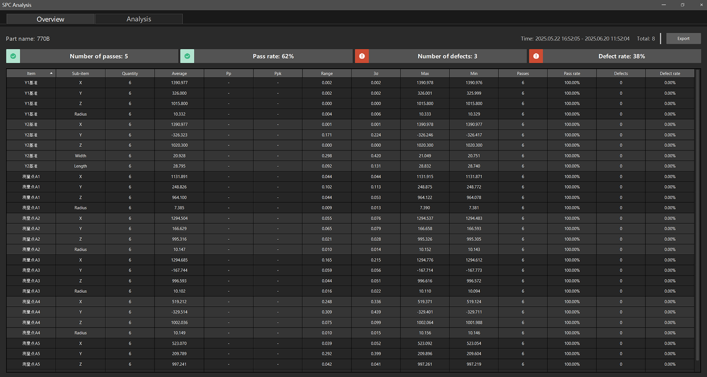
The following summary information is displayed at the top of the SPC Overview page:
-
Number of passes: The number of features that meet the specifications.
-
Pass rate: The percentage of qualified features relative to the total number of features.
-
Number of defects: The number of features that do not meet the specifications.
-
Defect rate: The percentage of non-conforming features in the total number of features.
The data tables of the SPC Overview show the following statistics for each measurement item:
| Column name | Description |
|---|---|
Item |
Feature name (such as Y4 reference, Y2 reference, measurement point A1, etc.). |
Sub-item |
The name of the measurement sub-item (such as X, Y, Z, Radius, etc.). |
Quantity |
The number of samples for this measurement item. |
Average |
The average value of this measurement item. |
Pp |
Process Performance Index, used to evaluate whether the process performance meets specifications. |
Ppk |
Central Performance Index, which takes into account the deviation of the process mean based on Pp. |
Range |
The extreme difference (difference between the maximum and minimum values) of data. |
3σ |
3 times the standard deviation. |
Max |
The maximum measured value of this measurement item. |
Min |
The minimum measured value of this measurement item. |
Passes |
The number of qualified samples for this measurement item. |
Pass rate |
The pass percentage of this measurement item. |
Defects |
The number of unqualified samples for this measurement item. |
Defect rate |
The defect percentage of this measurement item. |
Click the Export button in the upper right corner to export the overview data of the SPC.
SPC Analysis
Click the SPC analysis tab at the top of the page. The SPC analysis page displays the sampling tool, measurement item list, and sampling result table.
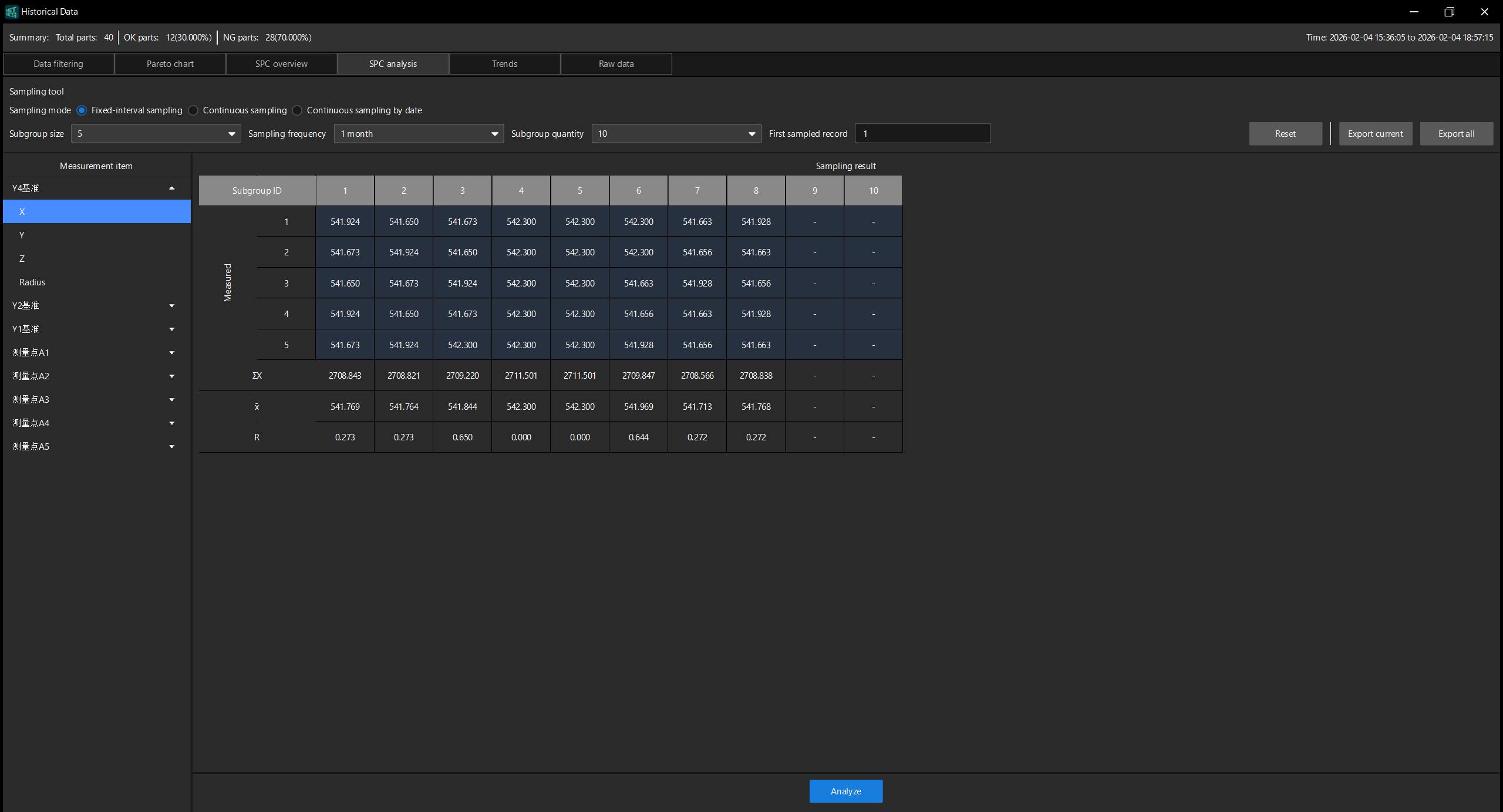
Perform SPC Analysis
Follow these steps to perform SPC analysis:
-
In the Sampling tool area, set the following parameters according to needs:
-
Sampling mode: Select the sampling mode. You can choose Fixed-interval sampling, Continuous sampling, or Continuous sampling by date.
-
Subgroup size: Set the number of samples in each subgroup.
-
Sampling frequency: Set the sampling interval.
-
Subgroup quantity: Set the number of subgroups.
-
First sampled record: Set the ID of the starting sample.
-
-
In the Measurement item list on the left of the page, select the measurement item to be analyzed. The list displays all the available measurement items for the current part (such as Y4 reference, Y2 reference, Y1 reference, measurement points A1 to A5, etc.). Under each measurement item, you can expand and select specific measurement sub-items (such as X, Y, Z, Radius).
-
The Sampling result table on the right of the page displays the sample data of the selected measurement item, including the Subgroup ID of each subgroup and the corresponding measured values, as well as the following statistics:
-
ΣX: The sum of the data in each column.
-
X̄: The average of the data in each column.
-
R: The difference between the maximum and minimum values of each column of data.
-
-
Click the Analyze button at the bottom of the page to perform SPC analysis. After the analysis is completed, the page will display the results.
-
To reset the parameter settings of the sampling tool, click Reset.
-
If analysis cannot be performed, troubleshoot the issue based on the error message provided by the software.
-
To return to the Sampling Settings page, click Back in the upper left corner.
-
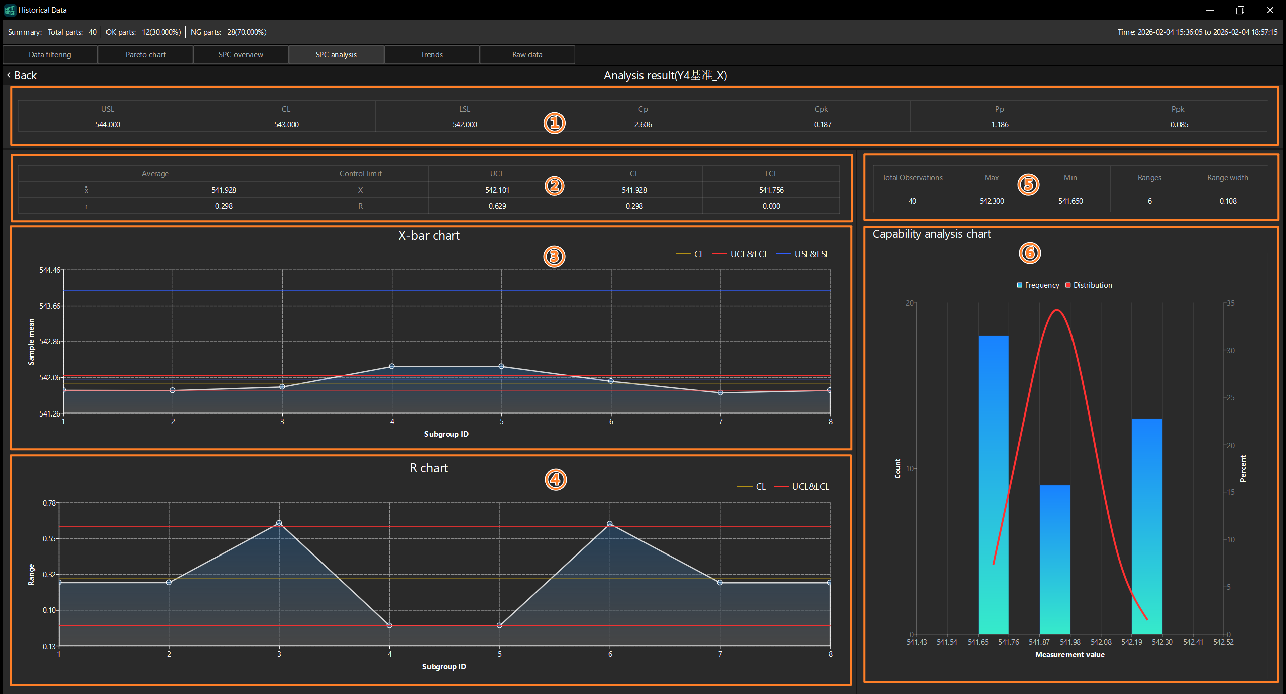
Analysis Result
The Analysis result page contains the following sections:
| No. | Area | Description |
|---|---|---|
① |
Displays key SPC indicators such as USL, CL, LSL, Cp, Cpk, Pp, and Ppk. |
|
② |
Displays the control limit data corresponding to X̄ (average) and R (range). |
|
③ |
A control chart with the Subgroup ID as the horizontal axis and the sample mean as the vertical axis, used to monitor the change trend of the process average. |
|
④ |
A control chart with the Subgroup ID as the horizontal axis and the range ® as the vertical axis, used to monitor the variation trend of process variation. |
|
⑤ |
Displays the statistics of the current measurement item, including Total Observations, Max, Min, Ranges, and Range width. |
|
⑥ |
Displays the frequency distribution of measurement data in a bar chart, with a superimposed normal distribution curve to visualize the data distribution and process capability. |
Indicator Bar
The top of the page displays the key SPC indicators of the current measurement item.

| Indicator | Description |
|---|---|
USL |
The Upper Specification Limit is the nominal value plus the upper tolerance. |
CL |
Center line, which is the average of the data. |
LSL |
The Lower Specification Limit is the lower limit of a dimension, which is the nominal value plus the lower tolerance. |
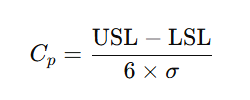
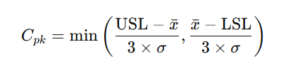
Cp |
The Process Capability Index is used to evaluate whether the capabilities of a process meet the requirements. In this example, σ represents the overall standard deviation. |
Cpk |
Process Capability Index, which takes into account the deviation of the process average based on Cp. In this example, x̄ represents the overall average, and σ represents the overall standard deviation. |
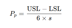
Pp |
The Process Performance Index is used to assess whether the performance of a process meets specification requirements. In this example, s represents the standard deviation of the sample. |
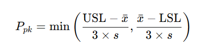
Ppk |
Process Performance Index, which takes into account the deviation of the process average based on Pp. In this example, x̄ represents the average value of the sample, and s represents the standard deviation of the sample. |
Control Limit Table
Displays the control limit data corresponding to X̄ (average) and R (range).

| Column name | Description |
|---|---|
Average |
The average of X̄ or R. |
Control limit |
Control limits. |
Upper Control Limit/UCL |
Upper Control Limit, which is the average value plus the value of 3σ. |
Centerline/CL |
Center Line, which is the average. |
Lower Control Limit/LCL |
Lower Control Limit, which is the average value minus the value of 3σ. |
X-bar Chart
A control chart with the Subgroup ID as the horizontal axis and the sample mean as the vertical axis, used to monitor the change trend of the process average.
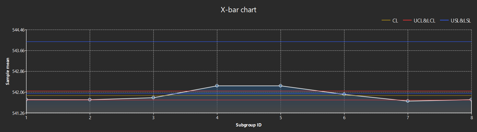
The figure contains the following reference lines:
-
CL (yellow line): the center line, which is the average.
-
UCL & LCL (red line): Upper and Lower control limits.
-
USL & LSL (blue line): Upper and lower specification limits.
R Chart
A control chart with the Subgroup ID as the horizontal axis and the range ® as the vertical axis, used to monitor the variation trend of process variation.
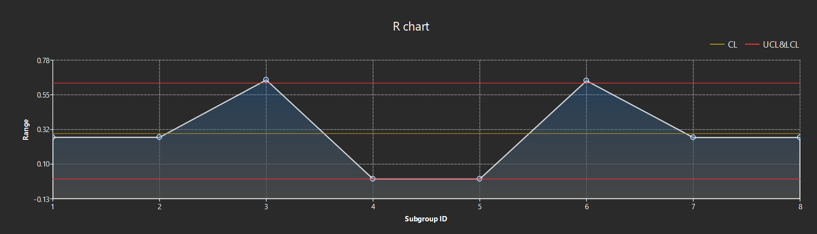
The figure contains the following reference lines:
-
CL (yellow line): center line.
-
UCL & LCL (red line): Upper and Lower control limits.
Statistics
The statistics of the current measurement item are displayed in the upper right corner of the page.
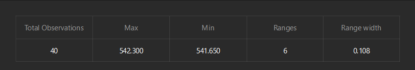
| Parameter | Description |
|---|---|
Total Observations |
The total number of samples involved in the analysis. |
Max |
The maximum measured value of all samples. |
Min |
The minimum measured value of all samples. |
Ranges |
The number of ranges in the capability analysis chart. |
Range width |
The width of each range. |
Capability Analysis Chart
The frequency distribution of the measurement data is displayed in a bar chart in the lower-right corner of the page, with a superimposed normal distribution curve, intuitively reflecting the data distribution and process capability.
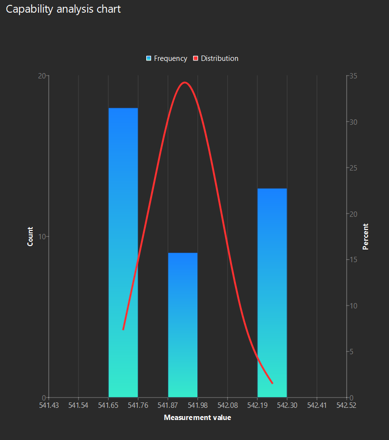
-
Blue bar (Frequency): displays the number of samples within each measurement range.
-
Red curve (Distribution): A fitted curve that shows the normal distribution of the data.
Export Analysis Report
After the analysis, click Back in the upper left corner to return to the Sampling Settings page, and then click the export buttons in the upper right corner to export the analysis report:
-
Export current: Export the analysis report for the current selected measurement item.
-
Export all: Export the analysis report for all measurement items.